2027 USQ CUP LOGO DESIGN
Each year, over 40 college and club quadball teams from across the United States train, travel, and compete for the chance to play at USQ’s premier event: the US Quadball Cup.
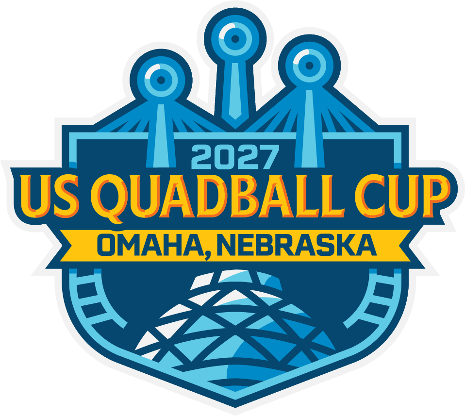
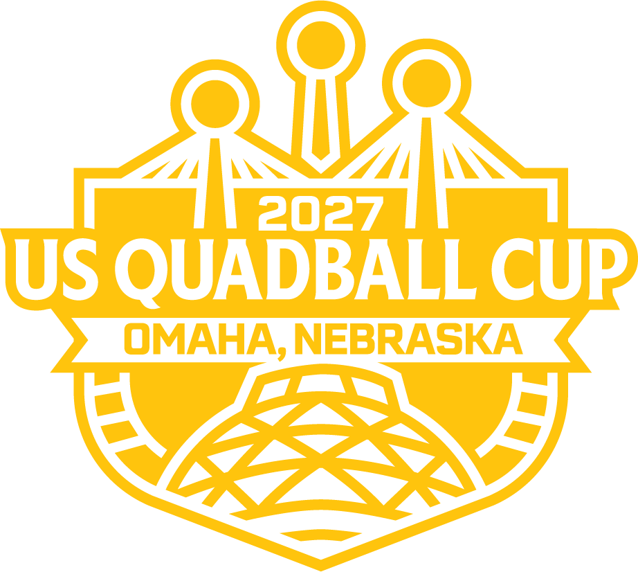
For the 2027 USQ Cup in the Omaha Metro Area, USQ once again partnered with designer Austin Sharp to create a logo that captures both the host city and the significance of the organization's premier championship event.

PROCESS
Designer Austin Sharp talks about the process.
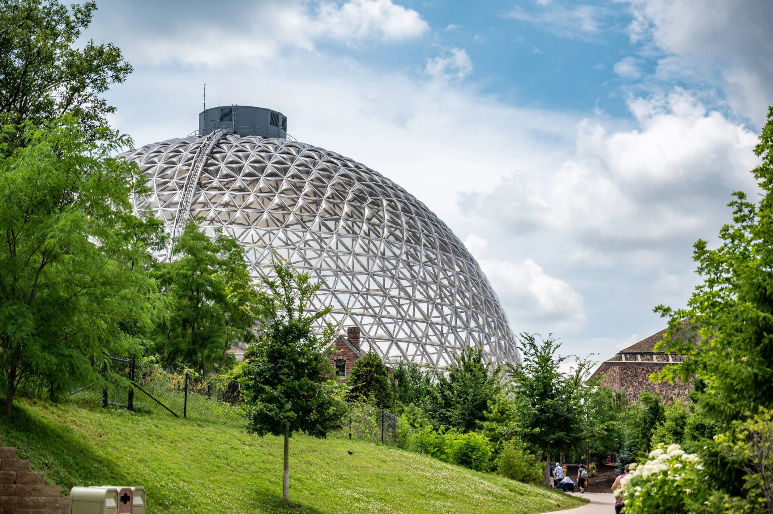
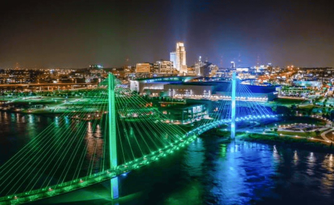
The logo features two key landmarks to Omaha, the Desert Dome at the Omaha Zoo and the Bob Kerrey Pedestrian Bridge. These landmarks were chosen because of their ability to be recognized in a low-detail rendering, while also being fitting signifiers for the city.
The Desert Dome is a beloved exhibit at the zoo, and is recognized as one of the greatest zoo exhibits worldwide, featuring the world's largest indoor desert. The Bob Kerrey Pedestrian Bridge allowed Sharp to place the hoops into an aspect of the host city, which is convenient for space and represents the world of quadball coming to Omaha. The border running along the bottom edge of the logo is expanded to resemble train tracks as a representation of the importance of railroads to the history and growth of the city. The colors of the logo draw on the city's official flag as well as some of the proposed alternatives posed by residents of the city.
COLOR PALETTE
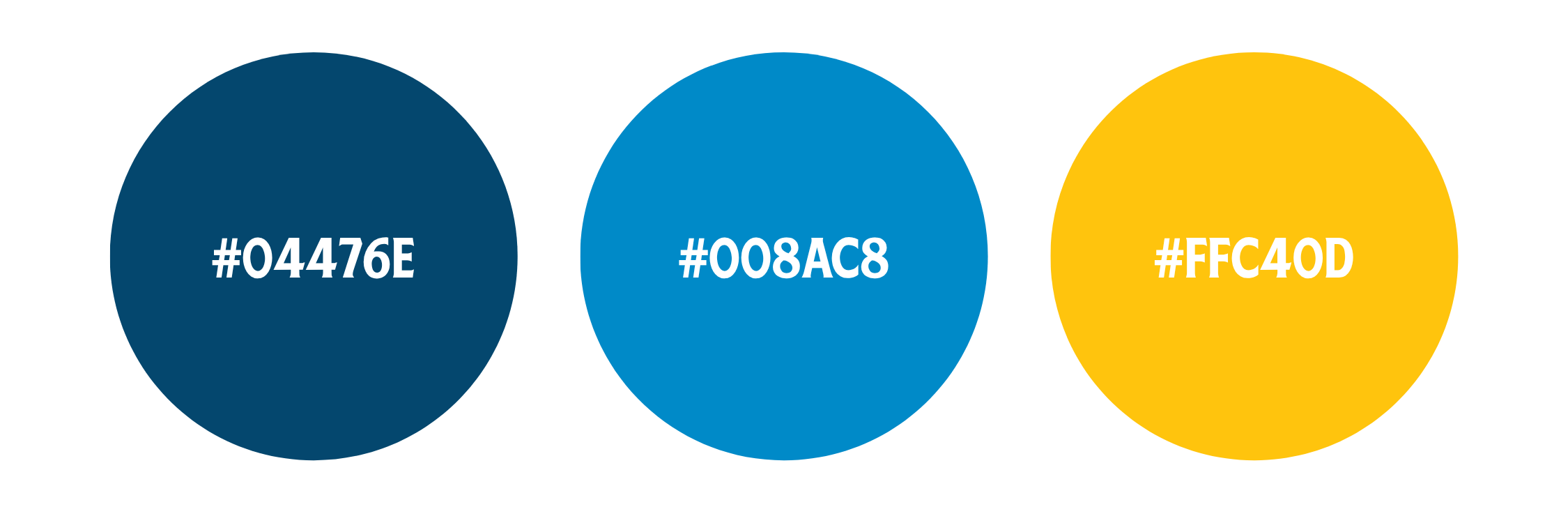
The color palette is rooted in USQ's visual identity. Deep navy and vibrant blues provide a strong championship feel while also reflecting the Missouri River that has shaped Omaha's history and landscape. Bright gold accents add energy, prestige, and visibility, helping the event branding stand out while reinforcing the significance of competing for a national title.
TYPOGRAPHY
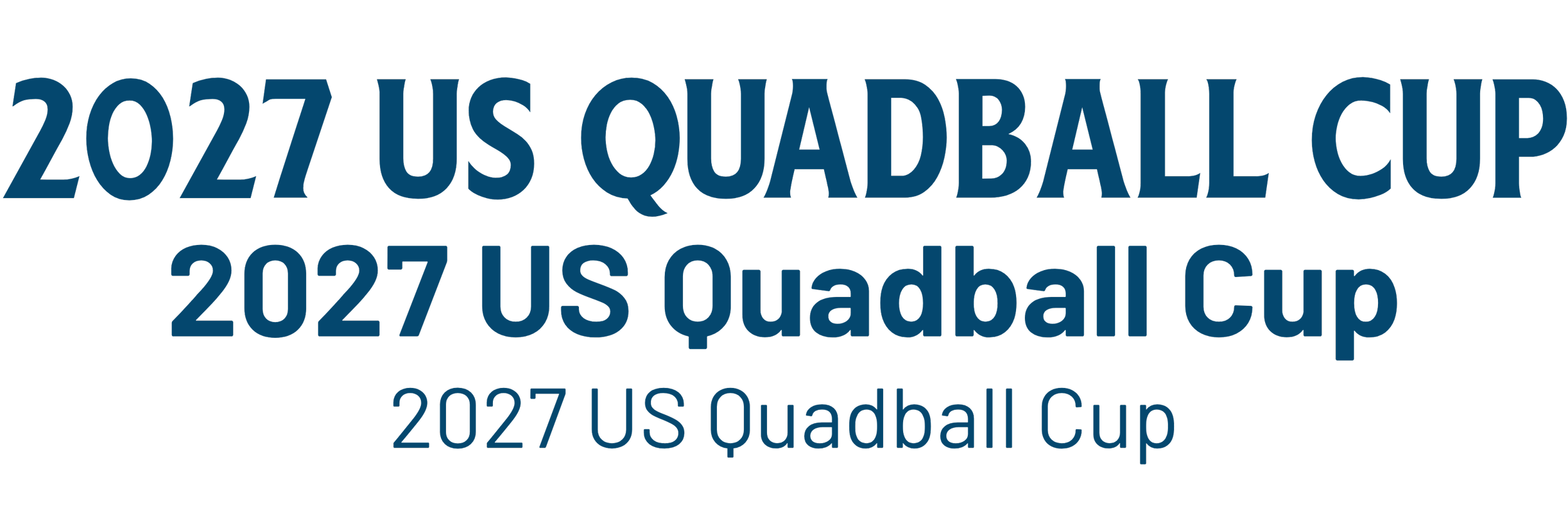
Typography was selected to balance tradition and impact. The championship wordmark uses HeinzLabel (yes, the ketchup font). It’s a bold, serif display style font that conveys the prestige and history of USQ Cup. Barlow will be used as the secondary font. It is a clean, modern sans serif that emphasizes clarity and readability. The combination creates a visual identity that feels both established and forward-looking, reflecting a sport that continues to grow while honoring its roots.
Want to hire our designer, Austin Sharp, to make your logo? Contact: asharp95@gmail.com